
Compelling visualizations of ice loss
You may have noticed the Arctic Death Spiral graphic that’s been added to the right-hand column. The small version there is a bit hard to read, but if you click on it, you’ll get a larger view. This great resource was created by Andy Lee Robinson to show how dramatically we have lost ice from the Arctic region since 1979. He updates the graphic as new PIOMAS data becomes available each month.
Andy has also produced videos showing the data being traced year by year for each month. These are fascinating because the audio track follows the data, so you can hear the ice volume spiraling down in addition to seeing it.
Have a look at the May 2013 versions for yourself. The synthesizer version ….
or the piano version ….


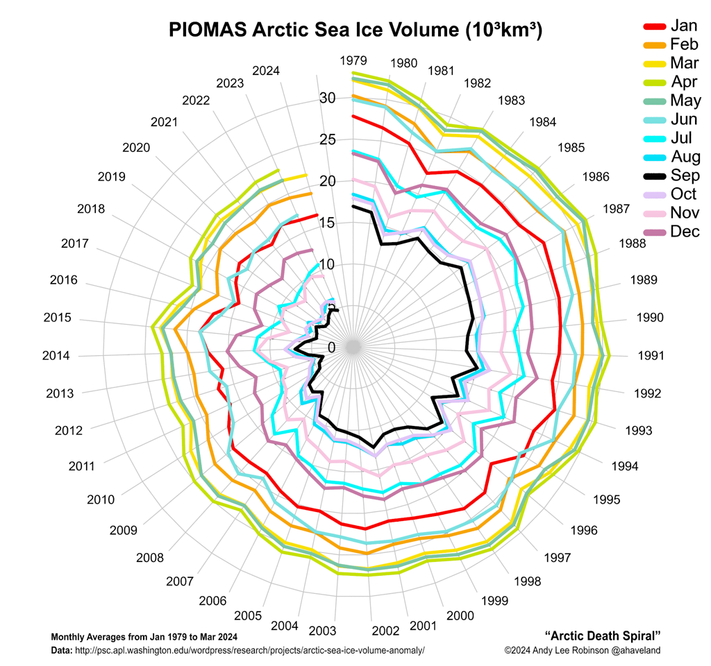


Andy is an invaluable resource to those o us who follow the science of climate change, and this latest effort is stunning. It’s also frightening how badly we humans have screwed this planet up, and I hope rational blogs, like yours, and visualizations like Andy’s work in waking people up, to put pressure on their leaders to do something about it.
NPR posted a picture of the lake at the North Pole today. yikes!
This is a very clever, succinct and unequivocal way to present the information. Really appreciated – it will be laminated and on our fridge door shortly! A great conversation starter for sure.
On the opposite side of the planet, Antarctic sea ice, which is in the midst of its yearly growing cycle, is heading toward the largest extent on record, having reached 7.45 million square miles (19.3 million square kilometers) on Aug. 21. Source: http://www.nasa.gov/
Of course, the animations above are showing Arctic sea ice volume, which is very different from extent.
Increasing sea ice extent in the Antarctic is one of the consequences of global warming:
Is Antarctica losing or gaining ice?
Global warming expands Antarctic sea ice